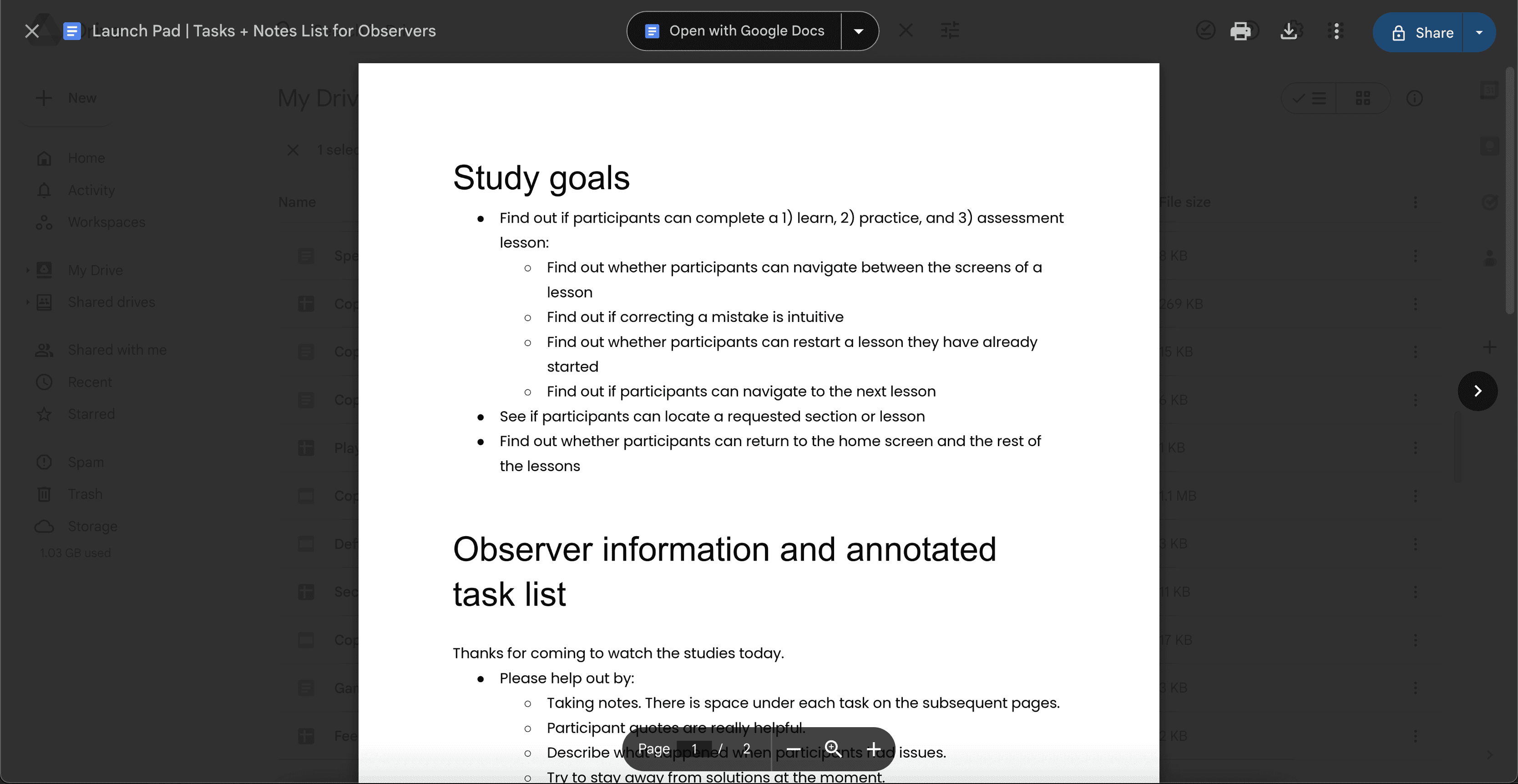
Launch Pad Navigation

Launch Pad Navigation

Launch Pad Navigation

Role

UI Designer

UX Researcher

Role

UI Designer

UX Researcher

Team

Marie Oblad

Team

Marie Oblad

Skills Used

UX Research

Interactive design

Motion design

Skills Used

UX Research

Interactive design

Motion design

Tools

Figma

Illustrator

Tools

Figma

Illustrator

Year

2022

Year

2022

_about

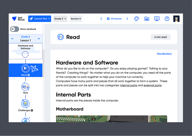
Learning to code should feel like an adventure, not an obstacle course. But for many K-5 students using Skill Struck's Launch Pad, the platform felt more like a maze, especially on smaller screens. While a variety of activities like textbooks, quizzes, coding challenges, and games offered valuable learning tools, the cluttered interface made it difficult for students to locate activities and transition smoothly between them.

_the challenge

Teachers noted that students frequently become confused when transitioning to the next activity. Without a clear structure, students struggled to navigate the platform, leading to frustration and disengagement.

Could we create a more intuitive, student-friendly experience while maintaining the platform’s rich educational content?

Could we create a more intuitive, student-friendly experience while maintaining the platform’s rich educational content?

research

research

To ensure our redesign addressed real user pain points, we focused on key questions:

_research focus

  • What activities do students engage with most?

  • Where do students struggle with navigation?

  • How does the platform perform on smaller screens?

  • What usability differences exist between younger and older students?

Contextual Interviews

We conducted interviews with teachers and observed students across three age groups: younger (3–5), mid-range (6–8), and older (9–12). According to NN/g research, each group interacts with digital interfaces differently, making this segmentation crucial.

Reflections
Reflections
Reflections

Findings

  • Students had trouble moving between activities or returning to a previous task.

  • The interface was overcrowded, making navigation difficult on smaller screens (e.g., Chromebooks).

  • Required vs. optional activities weren’t clearly marked, leaving students confused about what to complete.

  • Older students searched for traditional navigation tools (like a "back" button), while younger students relied on simpler, more visual cues.

  • Younger students quickly abandoned tasks if they found them frustrating or hard to follow.

Heuristic Evaluation

To further assess usability, I conducted a heuristic evaluation and found additional issues
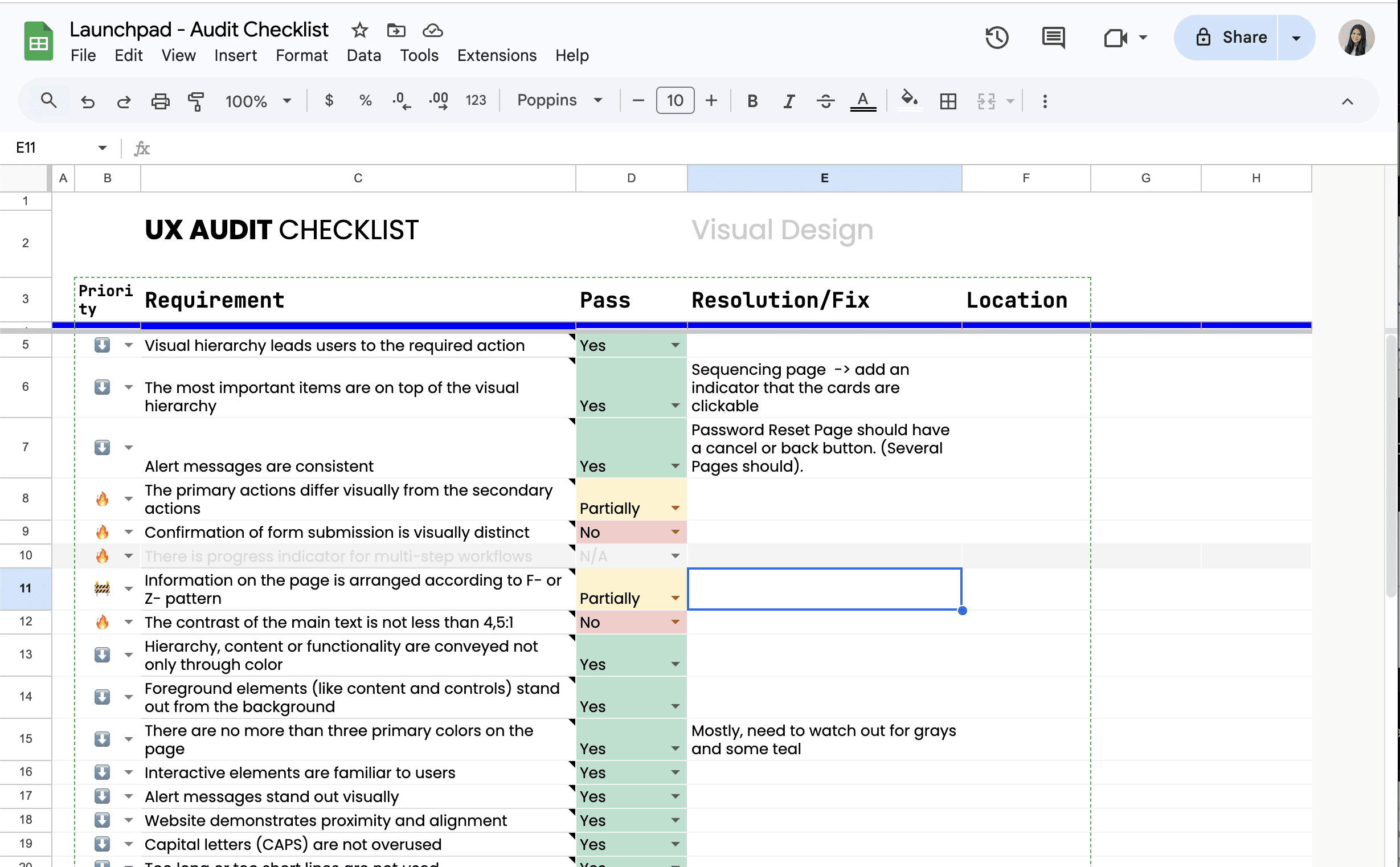
Reflections
Reflections
Reflections

Findings

  • Primary actions (e.g., “Start” or “Submit”) didn’t always stand out visually.

  • Quiz submissions lacked clear confirmation feedback.

  • Text contrast didn’t meet accessibility standards in some areas.

  • Certain pages required excessive scrolling to reach key information.

  • Too many clicks were needed to complete tasks, leading to inefficiencies.

Personas

Based on the interview and survey data, I created personas representing key user types: young learners, teachers, and platform administrators. These personas helped clarify user needs and ensured that design decisions were driven by real user goals and pain points.

Let's rebuild this platform so it flows like a well-written algorithm.

Let's rebuild this platform so it flows like a well-written algorithm.

design

design

_ideation

We wanted to simplify navigation, improve clarity, and create a more engaging learning experience. Our design priorities included:

Streamlined Navigation

A clearer, more structured menu to guide students effortlessly.

Optimized Layout for Small Screens

A decluttered interface with key elements placed strategically.

Progress & Task Indicators

Visual markers (such as icons or color coding) to differentiate required vs. optional tasks.

Age-Appropriate Design

A balance of traditional navigation for older students (e.g., back buttons) and more visual guidance for younger ones.

Wireframes & Iterations

To bring these ideas to life, we created low-fidelity wireframes and tested different layouts with users.

Reflections

In the low-fi iterations, I tried out different navigation styles like path-based, section-to-unlock, linear with graphics, and section-based layouts.

Reflections

In the low-fi iterations, I tried out different navigation styles like path-based, section-to-unlock, linear with graphics, and section-based layouts.

Reflections

In the low-fi iterations, I tried out different navigation styles like path-based, section-to-unlock, linear with graphics, and section-based layouts.

Reflections

I also prototyped various breadcrumb styles that were visually engaging and intuitive for younger learners.

Reflections

I also prototyped various breadcrumb styles that were visually engaging and intuitive for younger learners.

Reflections

I also prototyped various breadcrumb styles that were visually engaging and intuitive for younger learners.

Key refinements

Taking the feedback from the low-fi wireframes, we made some key changes to improve the design:

  • Switching from a flexible, path-based lesson menu to a more structured, linear format to simplify progression.

  • Mixing text-based navigation with illustrations to cater to both younger and older students.

  • Adding a dropdown menu with platform options and a main menu with platform icons to improve cross-platform navigation.

Once the high-fidelity wireframes were developed, we further refined the design based on conversations with teachers and steakholders.

hi-fi wireframes

Reflections

I designed a lesson menu that aligns perfectly with our product visual, while also keeping it engaging for users.

Reflections

I designed a lesson menu that aligns perfectly with our product visual, while also keeping it engaging for users.

Reflections

I designed a lesson menu that aligns perfectly with our product visual, while also keeping it engaging for users.

Reflections

Added progress bars and checkmarks to show which activities were started and completed.

Reflections

Added progress bars and checkmarks to show which activities were started and completed.

Reflections

Added progress bars and checkmarks to show which activities were started and completed.

Reflections

We chose a sidebar tab navigation with illustrated elements resembling a journey path, allowing students to easily navigate between activities while tracking their progress.

Reflections

We chose a sidebar tab navigation with illustrated elements resembling a journey path, allowing students to easily navigate between activities while tracking their progress.

Reflections

We chose a sidebar tab navigation with illustrated elements resembling a journey path, allowing students to easily navigate between activities while tracking their progress.

Reflections

I designed unique icons to represent each activity, making it easier for users to identify and navigate through the content.

Reflections

I designed unique icons to represent each activity, making it easier for users to identify and navigate through the content.

Reflections

I designed unique icons to represent each activity, making it easier for users to identify and navigate through the content.

Reflections

In the low-fi iterations, I tried out different navigation styles like path-based, section-to-unlock, linear with graphics, and section-based layouts.

Reflections

In the low-fi iterations, I tried out different navigation styles like path-based, section-to-unlock, linear with graphics, and section-based layouts.

Reflections

In the low-fi iterations, I tried out different navigation styles like path-based, section-to-unlock, linear with graphics, and section-based layouts.

Reflections

I added menus in the top navigation bar to let students switch between platforms and sections easily.

Reflections

I added menus in the top navigation bar to let students switch between platforms and sections easily.

Reflections

I added menus in the top navigation bar to let students switch between platforms and sections easily.

Reflections
Reflections
Reflections

I added engaging modals to congratulate students on completing activities. They also provided a direct link to the next activity and displayed the points awarded.

I wanted to make things efficient by focusing on quick access to essential info for housing officials. The dashboard offers an easy overview of housing statuses and speeds up the process for handling student requests.

I wanted to make things efficient by focusing on quick access to essential info for housing officials. The dashboard offers an easy overview of housing statuses and speeds up the process for handling student requests.

evaluation & impact

evaluation & impact

After testing the updated design with students, we identified additional refinements:

Findings

  • A card-based layout made content easier to scan and reduced cognitive load.

  • Eliminating unnecessary screens improved the user flow by reducing extra clicks.

  • Redesigning activity layouts minimized scrolling, making it easier to complete challenges.

Reflections

We updated the activity card layout from a full-row span to a grid format, making navigation smoother and reducing scrolling.

Reflections

We updated the activity card layout from a full-row span to a grid format, making navigation smoother and reducing scrolling.

Reflections

We updated the activity card layout from a full-row span to a grid format, making navigation smoother and reducing scrolling.

With these updates, students were able to navigate the platform with less frustration and more focus on learning.

conclusion & next steps

conclusion & next steps

The redesigned Launch Pad now offers a smoother, more intuitive experience for K-5 students. By simplifying navigation, optimizing for small screens, and enhancing visual indicators, we’ve made coding more accessible and engaging.

What’s next?

  • Run A/B testing to fine-tune navigation for different age groups.

  • Continuously gather feedback from teachers and students to refine the experience.

  • Explore additional gamification features to boost engagement.

  • Improve accessibility to ensure an inclusive learning environment.

There’s still work to do, but we’re on the right path—just like a well-structured algorithm guiding students on their coding journey.

Marie Oblad

Marie Oblad

Marie Oblad